Before we start
Redesigning the post-booking experience of SWVL
Responsibilities – Design, Strategy, Research | Duration ~ 2 months
What does SWVL do?
SWVL is a pioneering transportation technology company that has successfully transformed the way people navigate cities and commute daily. Established with a vision to revolutionize urban mobility, offering a convenient, reliable, and affordable alternative to traditional public transportation.
The core principle behind SWVL's operations lies in providing a seamless experience for commuters. Through our intuitive mobile app, users can book a ride on demand, reserve seats in advance, and access fixed routes for daily commuting—all while enjoying air-conditioned, Wi-Fi-equipped vehicles. SWVL partners with professional drivers who are committed to ensuring a safe and enjoyable journey for every passenger.
The Problem we were trying to solve
Users have a difficult experience finding relevant information on the booking details screen, after booking a ride
What are the problems with pbx?
The problems in the existing experience were multifold. Which came out after talking to users and looking at the data
Boarding Pass
New users do not know what this is and how to use it – All captains ask for this when the user checks in. Users need to be educated to display/convey the boarding pass number to the captain when they board
Booking State
Users do not notice the current display of the state for upcoming bookings.
How can we effectively communicate to the user about the following
What is the current state?
What will happen next?
What is the next action expected from the user?
The problems with Maps & Stations
Users do not know the stops along the bus route. When the bus stops at a certain station, They need to know the reason for it if they open the tracking page.
If users have to get off along the way, without station visibility it is difficult to plan. And the major problem was with Stations & Station discovery.
- Users are sometimes confused about the station location since there is no physical station on the ground and often the naming is not exact.
- Without more contextual information the users are confused about where exactly to stand etc which adds up to anxiety.
- Need ways to provide confirmation for the user to know they are at the right spot.
Problems with communication & information
Captain and vehicle info
- When a ride is dispatched without captain or vehicle information, it appears blank to users and is confusing. The banner explaining at the top is not noticed by the users.
- There is a high contact rate to get information regarding the bus and captain.
- How can we reduce the bunch of calls received by the captains regarding their position or other requests from customers
Research & initial approach
We looked at data and Talked to our users


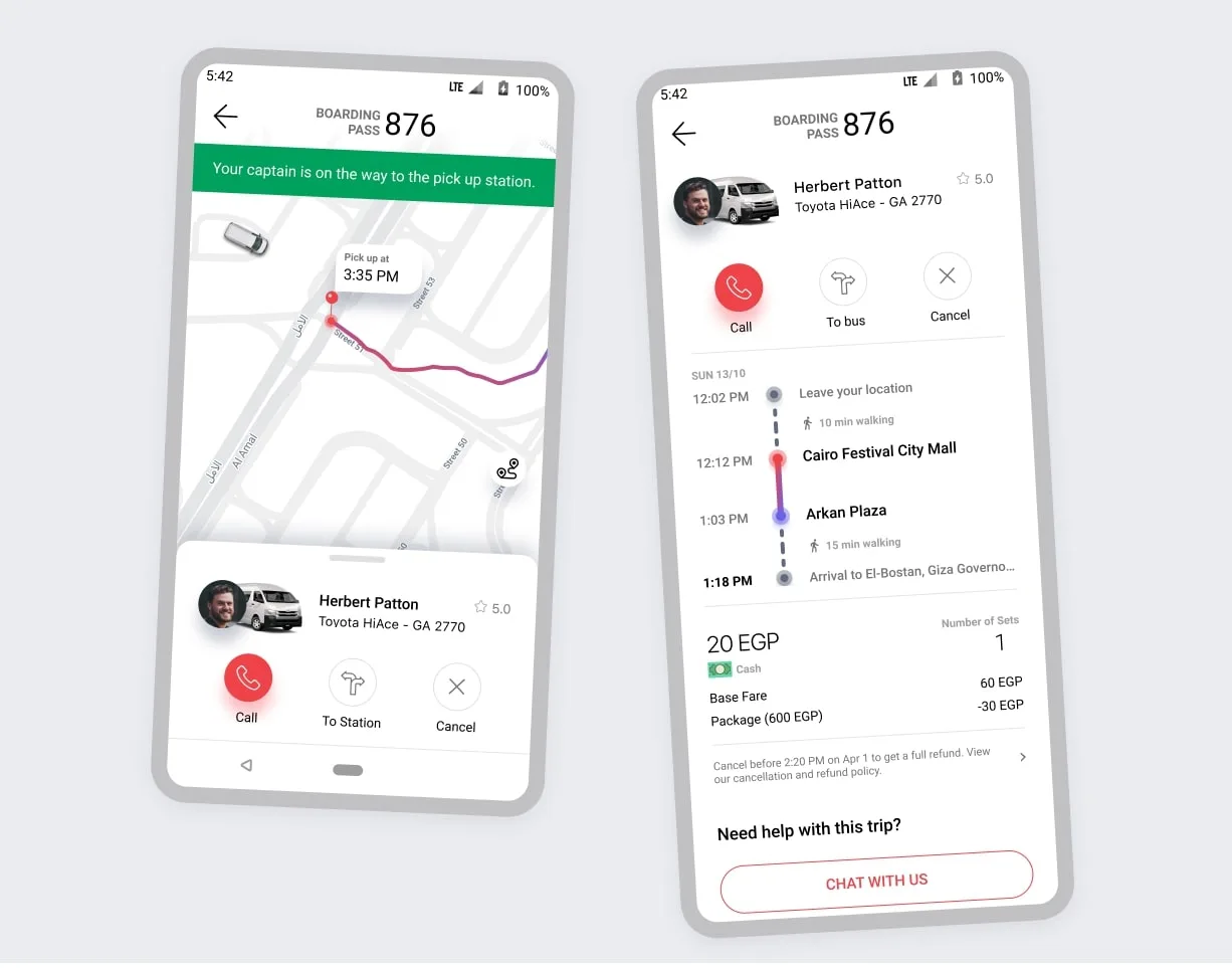
Old Experience
The Old user experience which had very less useful information regarding the ride
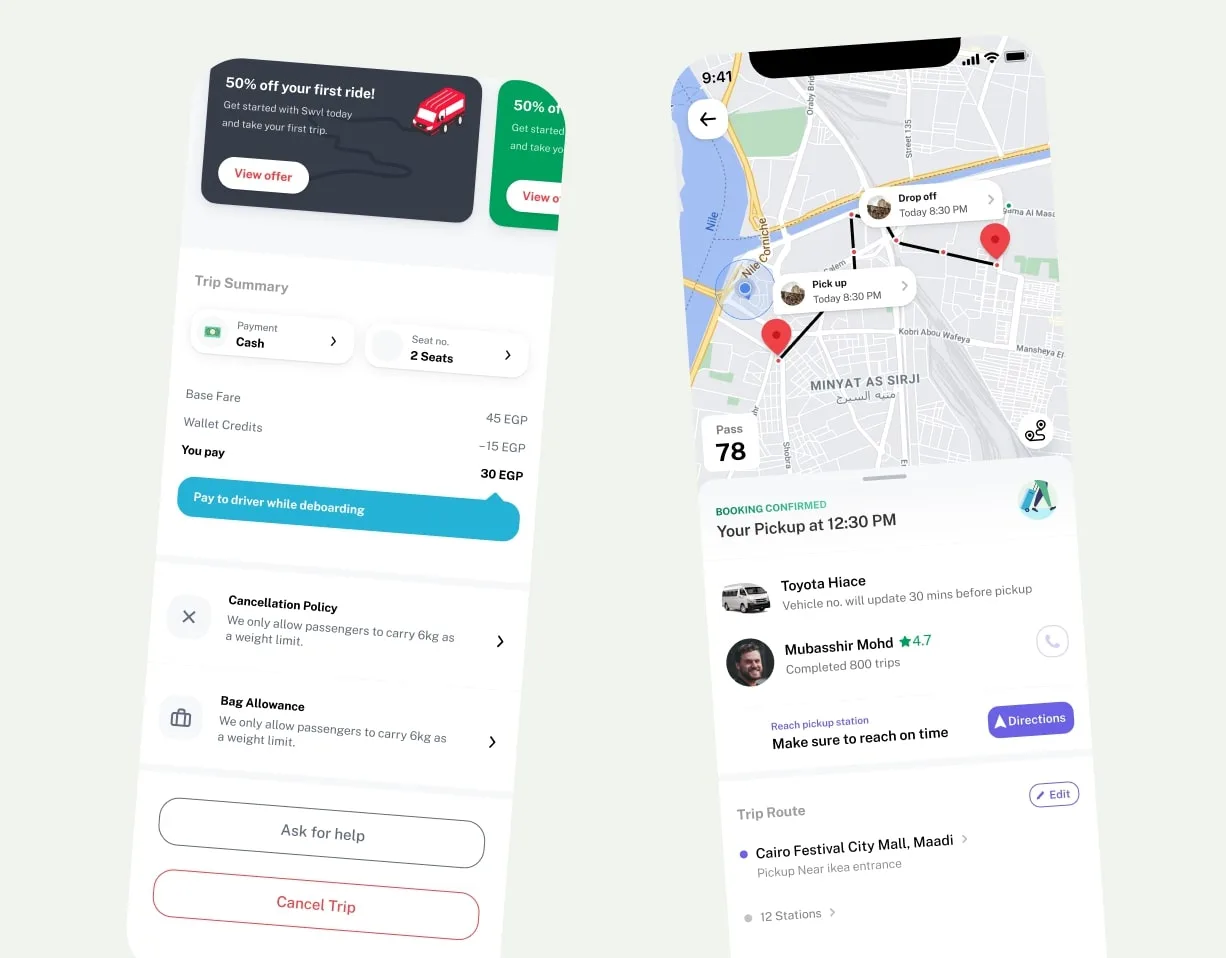
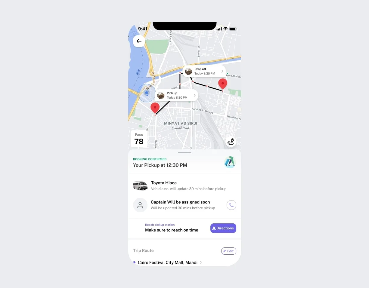
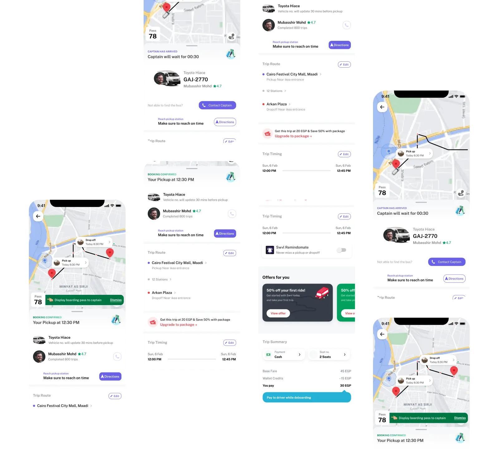
New Experience
The newly redesigned experience with priority to ride level information and additional things fixed


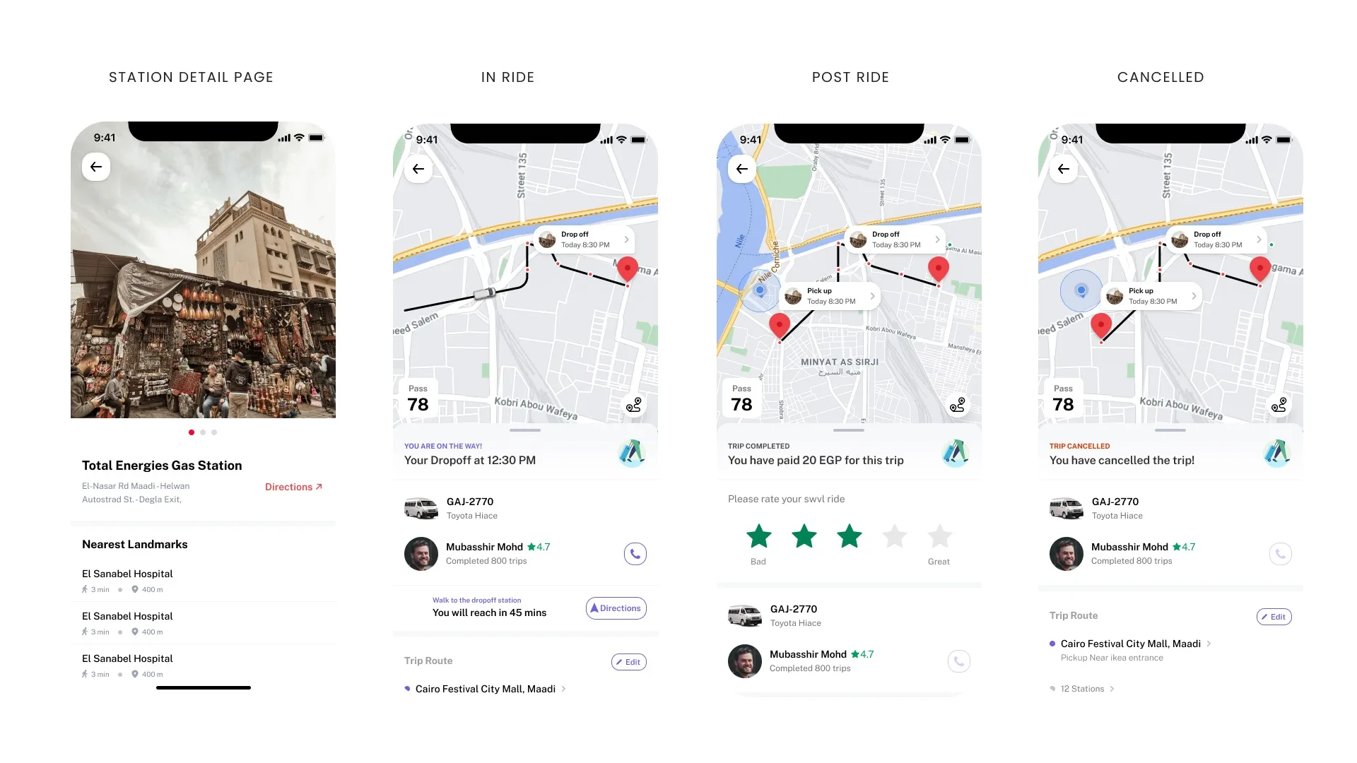
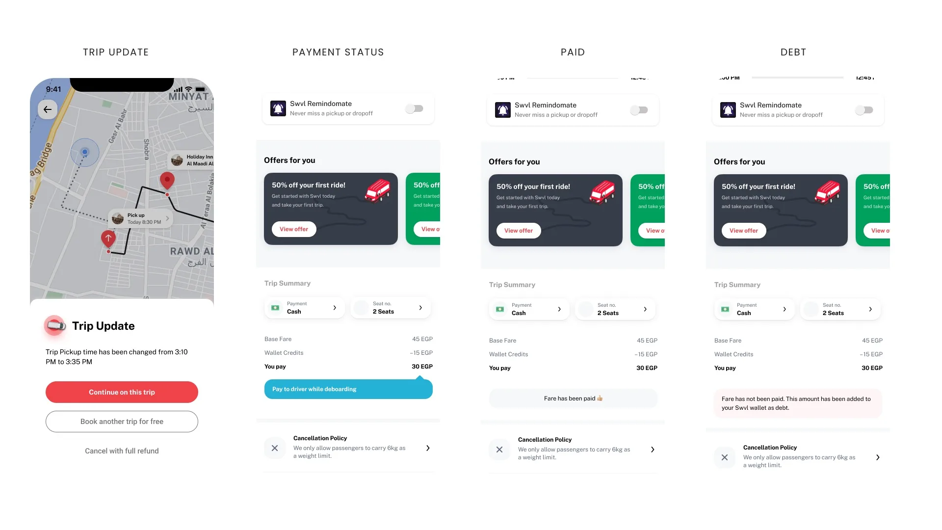
Other Additional States & Screens


Testing
We did a bunch of in-person & remote testing ~ 25 users from different cohorts
- Find & walk to the pickup station – 92% completion rate
- Driver & vehicle information – 96% users were able to identify and respond
- Boarding pass – 72% spotted it without any onboarding – 88% with onboarding
- Asked them to reschedule a trip – 70% completion rate – we had split the time & location reschedule which users were not expecting
- Policies – 90% were able to spot the cancellation & luggage policy
